I worked with the Sittercity executive team to reimagine their product vision, resulting in the decision to combine their two platforms, Sittercity.com and HelloChime.com, to solve for an assortment of issues across both platforms.
With that decision in hand, there was much technical work to be done, and it would be many months before the tech team would be ready to begin building the front-end for the new platform. A redesign was necessary, but the team had more immediate needs to address. Both previous platforms had struggled with keeping designs consistent and had multiple, different interface components that were solving similar problems across their respective platform. With that in mind, we decided that building a design system would be the best approach to begin work on this new platform.
In this instance, creating an internal design system solves for creating consistency within the new platform, while also reducing the need for internal skirmishes about what interface component to use, and ends up eliminating a lot of production work–thus eliminating the need for more junior level designers, opening up room within the design budget for more important efforts.
Competitive & Internal UI Audits
Partnering closely with the Sittercity marketing and tech teams throughout the process of creating the design system, beginning with conducting a competitive audit of design systems currently in production to understand common practices and trends across other design systems.
Once we had a solid understanding of the competition, I conducted a cross-platform UI audit. I printed out every screen of each experience on each platform and began recording the different content patterns and display patterns that were used across each.
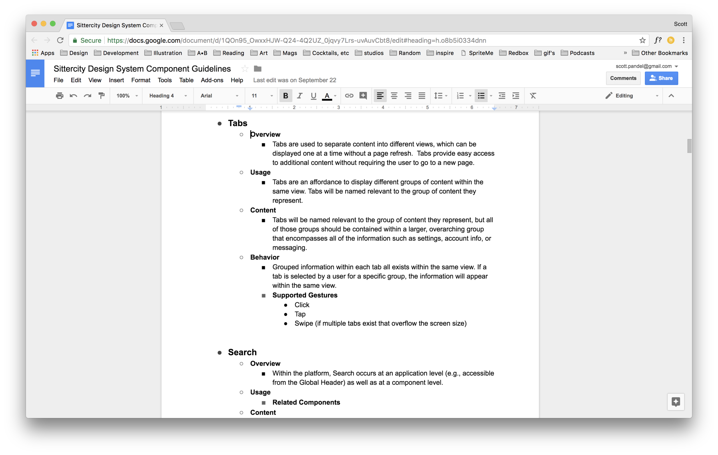
Defining Content & Display Patterns
Once completed, this allowed me to see how often certain content patterns and design patterns were used, and how they were treated on the old platforms. I used this information to create a google sheet that acted as a single source of truth for all of the content patterns and display patterns we would need for the new platform–this list would inform what components we would need for the new platform.

Now that we understood what components we needed to build, we decided to zoom out a bit and make sure we had principles that we could use guide the creation and govern the use of these individual components.
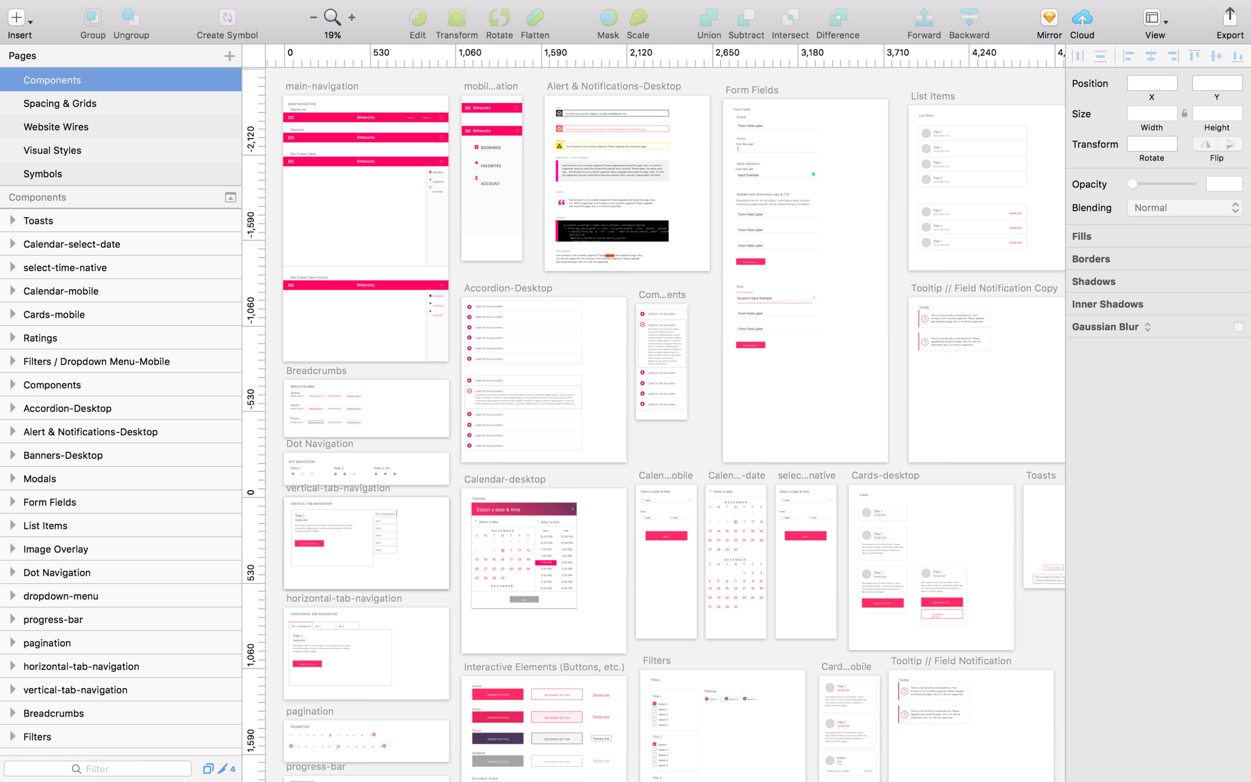
Creating the Design System
Again, working very closely with the marketing and tech teams, we created high-level principles for accessibility, design, interface content, and branding that would guide how to approach using and creating new components. Once the guiding principles were in place, I began creating the actual components. While in tandem, I also created guidelines for the styles used across the component library such as color palette, grids, spacing, iconography and motion.