Applying for a credit card in a retail store can be awkward and time consuming. People often worry that the information they provide isn’t totally secure. Additionally, paper applications can be a hassle to fill out, and take a while to process.
Our team created an entirely digitized credit card application experience that prioritizes people’s privacy and security, and empowers people to feel in control of their personal information and how it is communicated.
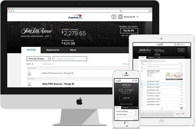
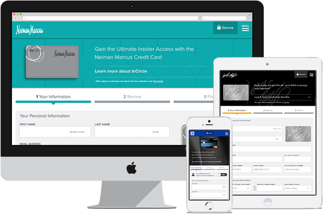
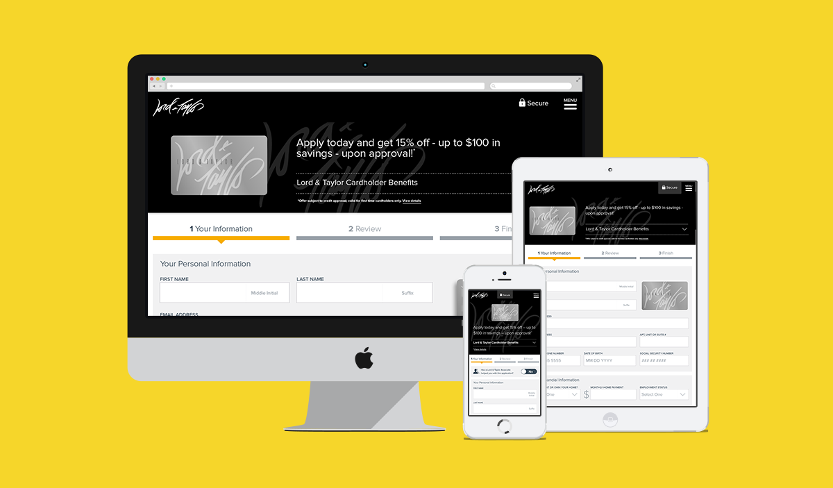
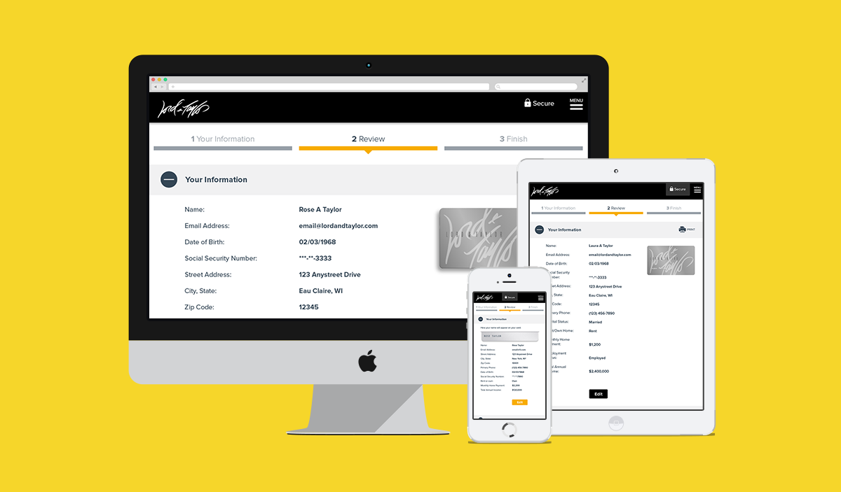
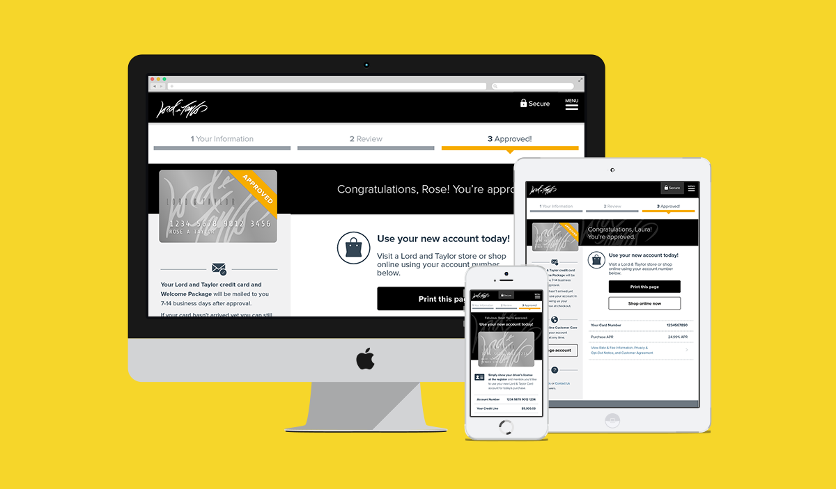
Our responsive, mobile-first credit card application platform dynamically fit each partner's brand specifications, and delivers a lightning-fast credit application process.
Paper Prototyping & Guerrilla Testing
—
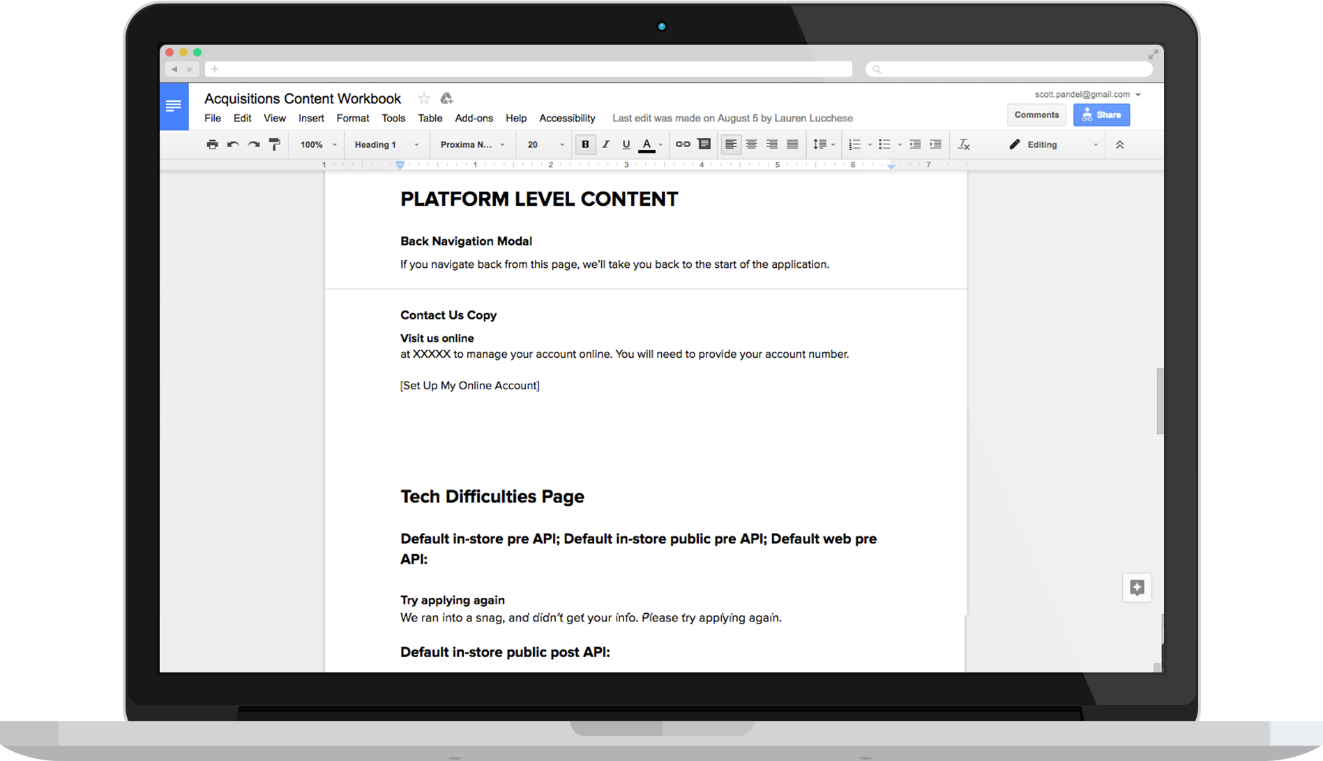
After taking a long, hard look at the legacy platform (read: audit time!), we began doing away with every redundant or unnecessary field we could.
Then, we visited our various partner store locations to gain a deeper understanding of the multiple entry-points that exist for the application, and learn more about how customers and associates interact with one another.
Once we had a firm understanding of the process, the context, and who was involved, we created several low-fidelity paper prototypes. We brought these to several partner stores and tested them on different customers to get a feel of any pain points we weren't addressing. I was sure glad we took this step because we dug up a lot of dirt.

Our final paper prototypes. Security was a huge issue, so we added the lock icon & 'secure' language at the forefront of the page, right on the header.
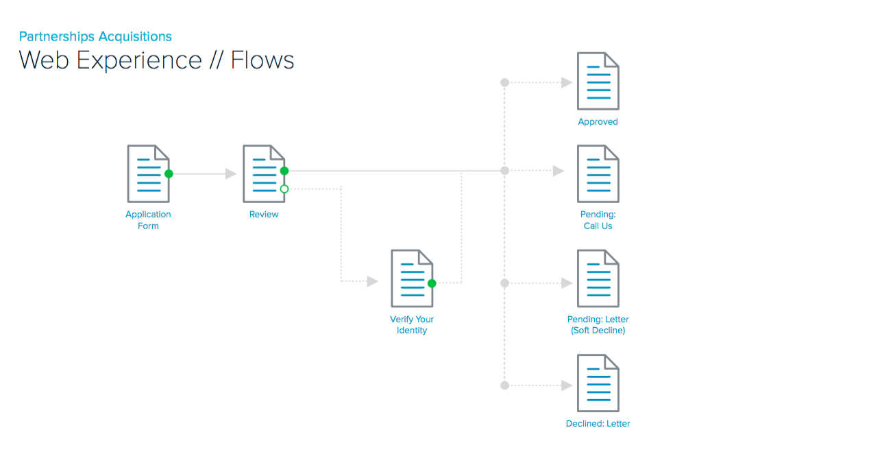
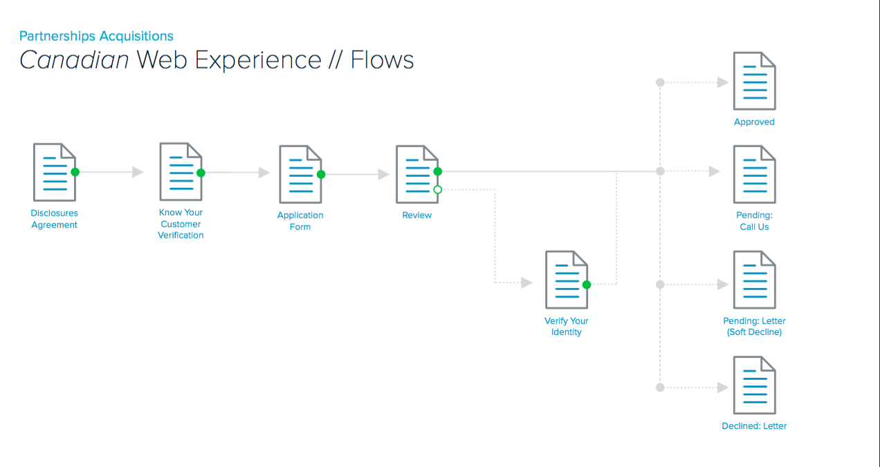
Creating a Paperless Application
—
We found that the biggest pain point in the application process for both associates and customers was the delivery of legal disclosures in the store. Many applications are submitted by customers on their phones, usually as they were waiting in line at the register. We wanted to design an experience that eliminated the friction of an associate having to scramble to find legal papers when that person made it to the front, and wanted to finish their application. Faster checkout experience for all!
The only caveat in a fully paperless experience was that the applicant would have to confirm that they received a copy of the disclosures electronically. So, we designed a step in the flow that gave applicants the option of having legal disclosures texted or emailed to themselves. They could reply via text or email to confirm the receipt, which made our lawyers happy. Three clicks later, they were on their way.
IA, Visual Designs & Usability Testing
—
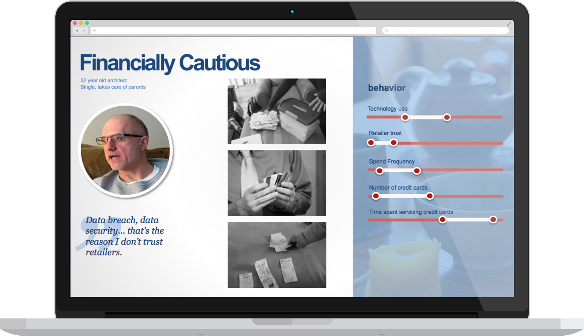
Once we had a solid idea of what our customer-base wanted from this application experience, we began building out IA flows and increasingly higher-fidelity prototypes, and continued to usability test them. Initially we conducted virtual usability tests on usertesting.com, and after a couple of iterations, brought participants into our lab.


Partner Migration Rollout & App Speed Test
—
Our development teams built our prototypes, and we launched an MVP build with a single partner. We took the learnings from that initial launch and incorporated them into future builds. We continued this pattern of iteration as we continued to migrate other partners onto the platform.
The design philosophy here was to enable applicants to complete the application as quickly and efficiently as possible, while also fostering confidence in the process. We knew that we needed to be providing the right information about what was happening at the exact right time the customer needed to know throughout the experience, so that customers could make an informed choice on whether the card was right for them.
We conducted a speed test against several competitive applications. Have a look below. Capital One is the Menards application. (Spoiler alert: we win.)
Not only did the customer experience improve by leaps and bounds, but the newly redesigned platform was far more successful than it's predecessor – with an average of an 87% increase in customer acquisitions across the platform over it's first year.
Please excuse the awful production value & even worse music.
Check Out Some Other Capital One Projects
–