I was one of the lead designers on our legacy servicing platform redesign project. Since this platform would be where customers go to manage their account, the stakes were high. We knew that we had to design something straightforward, efficient, and wholly worthwhile. This is a major touchpoint in our customer’s relationship with us.
The result? We designed a responsive, modular, mobile-first credit-card servicing platform dynamically modifiable to fit partner branding and feature requests.
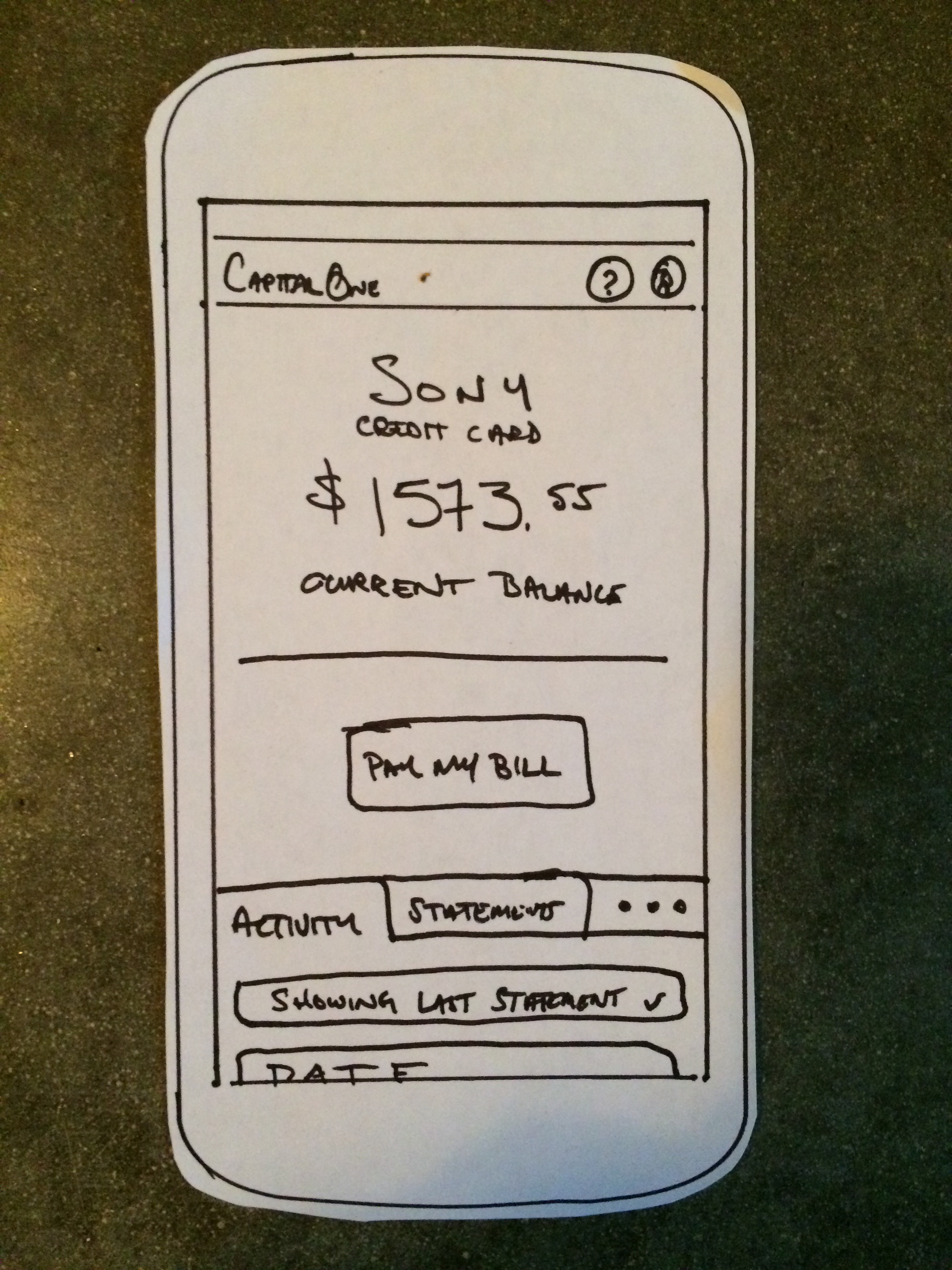
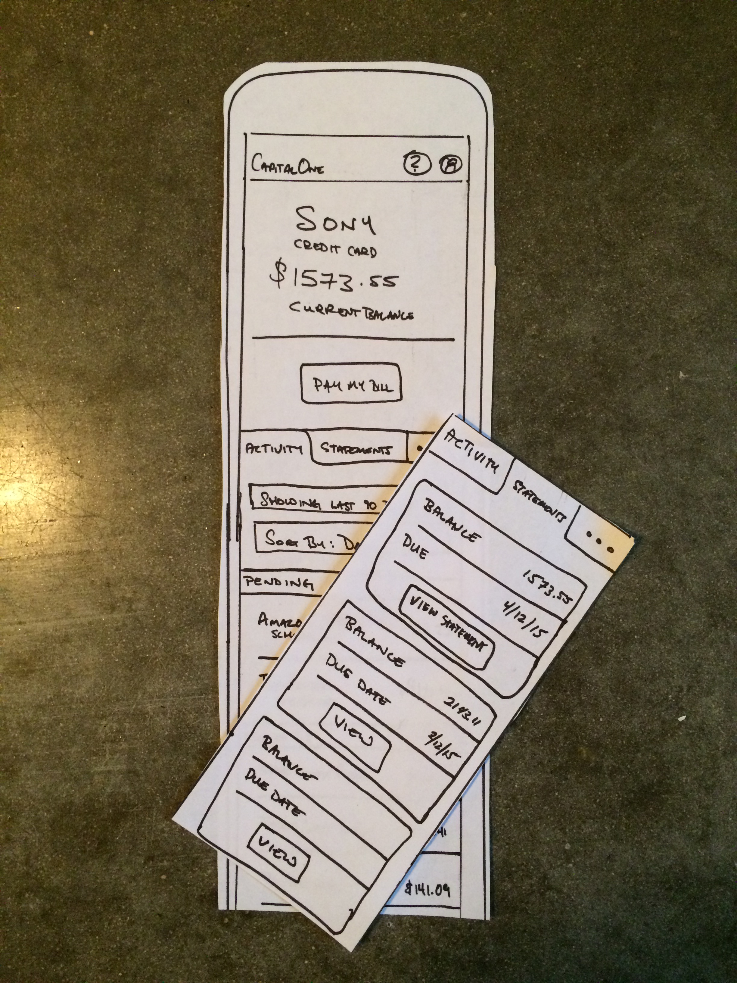
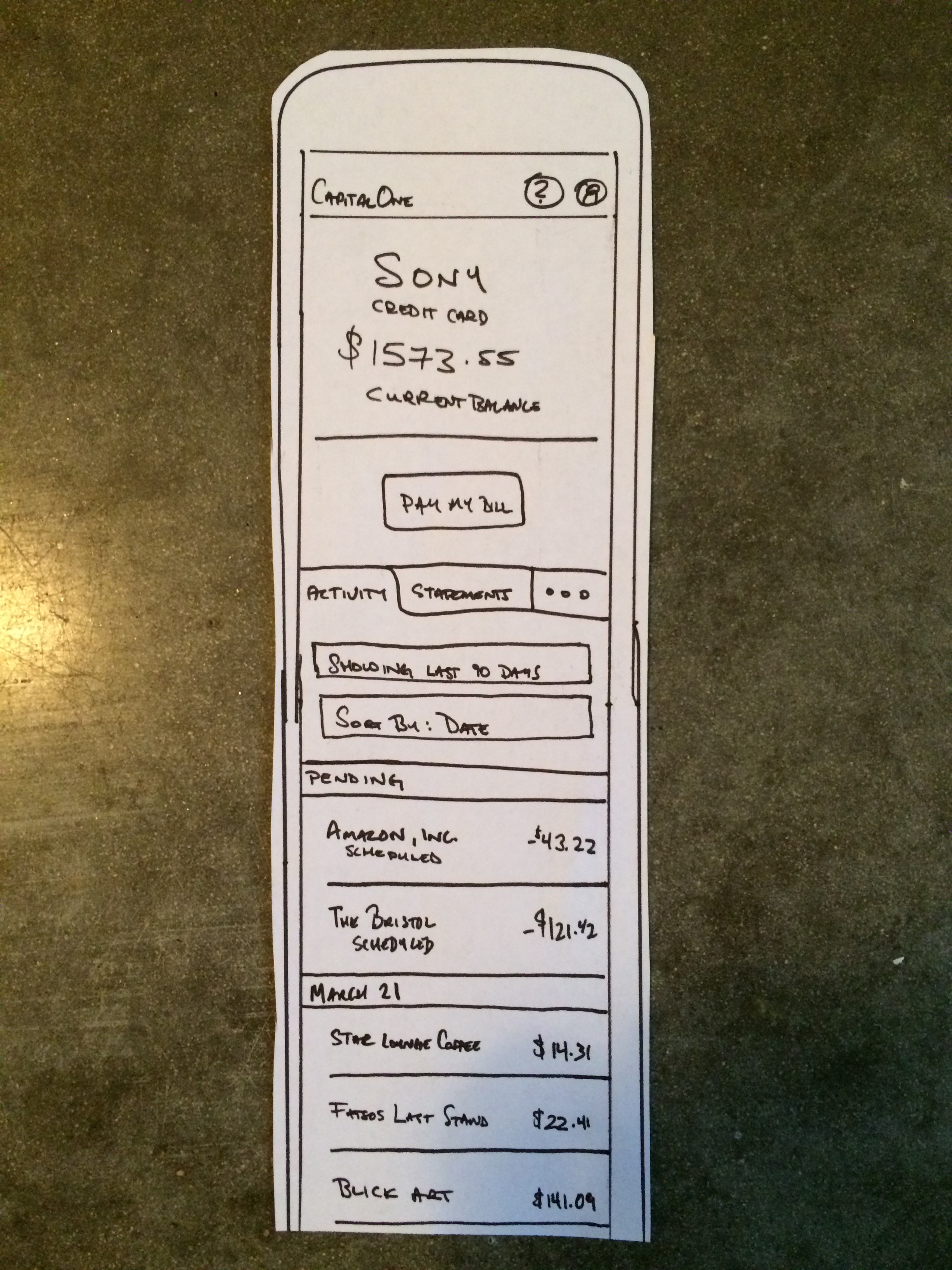
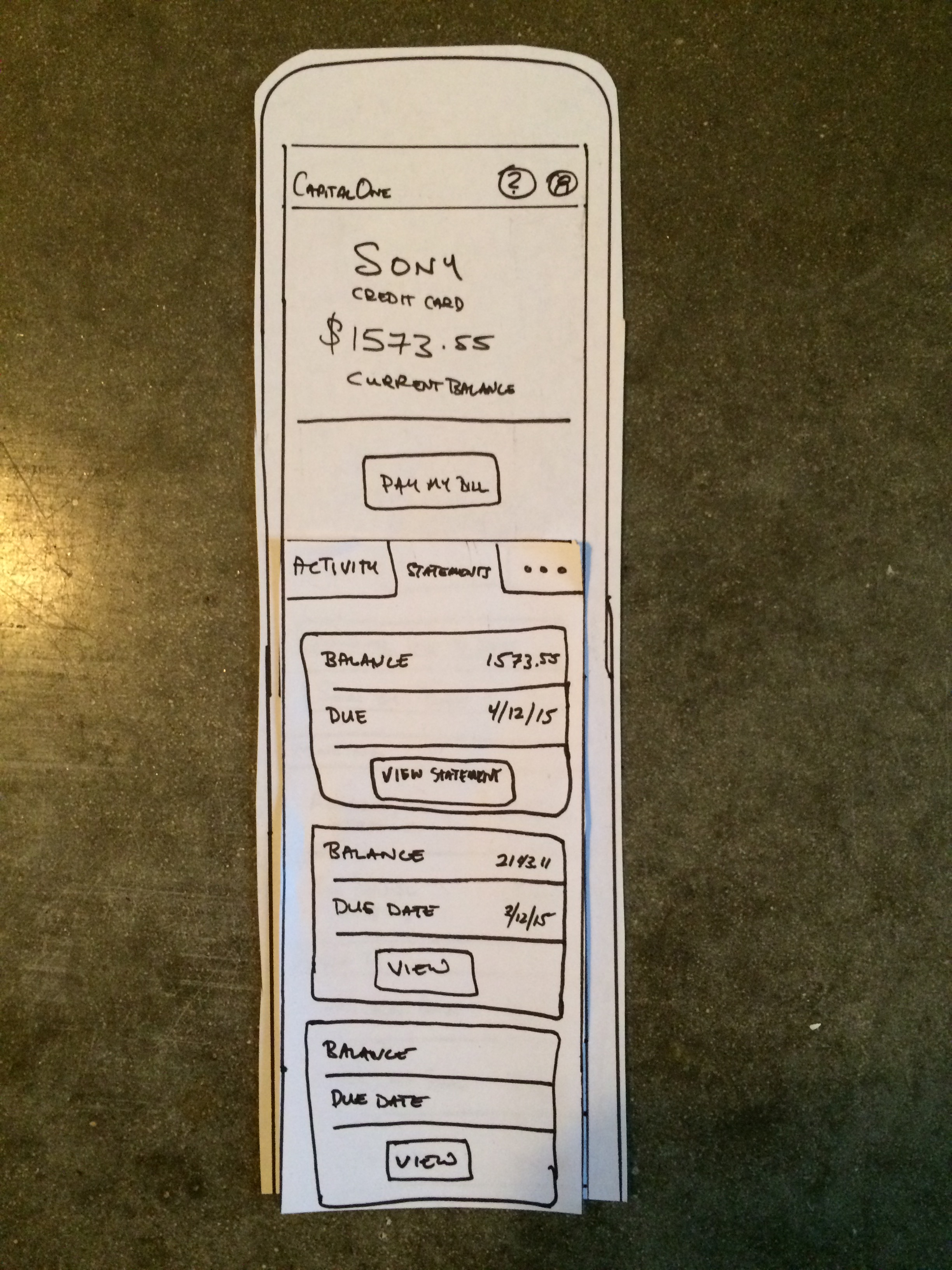
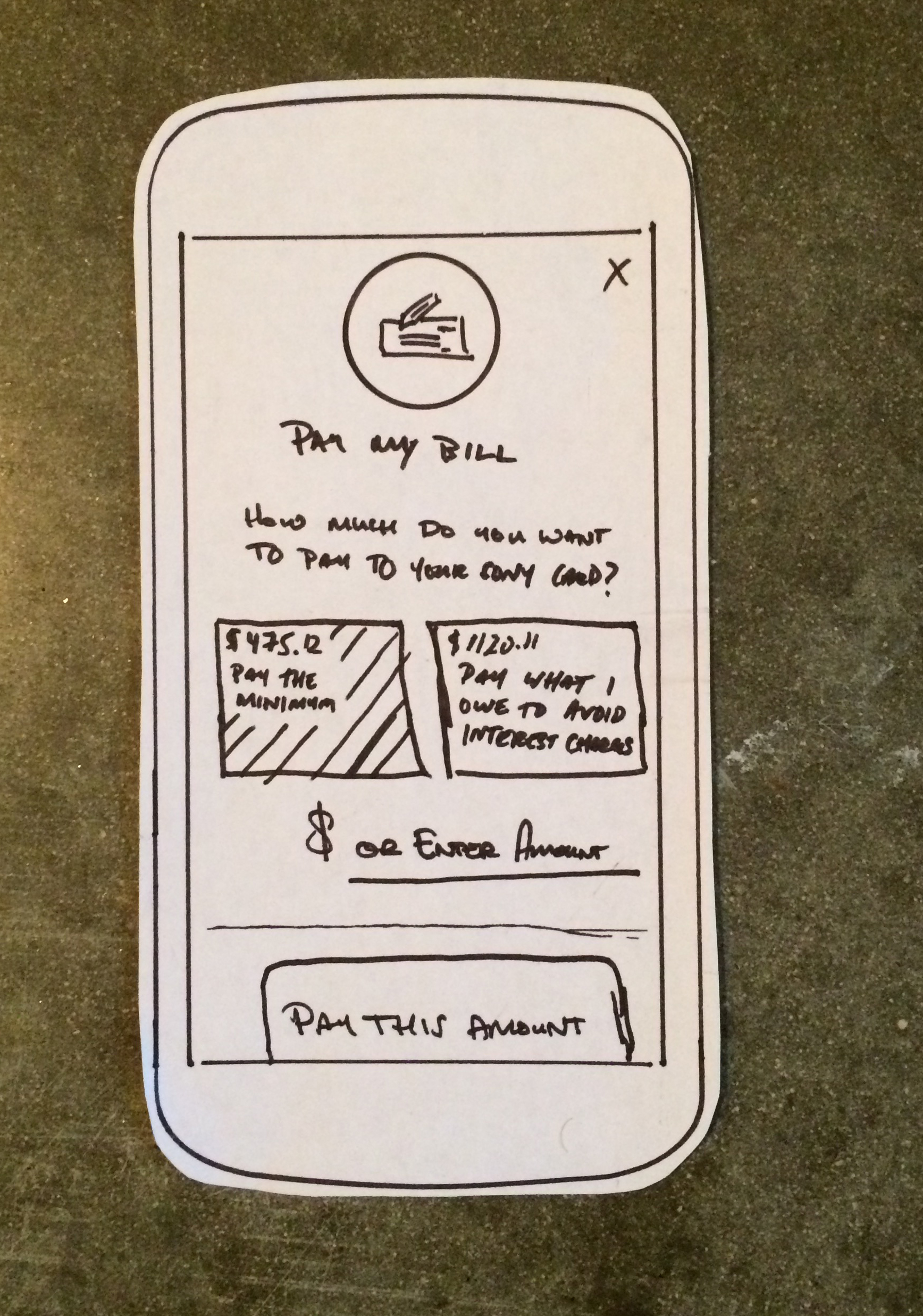
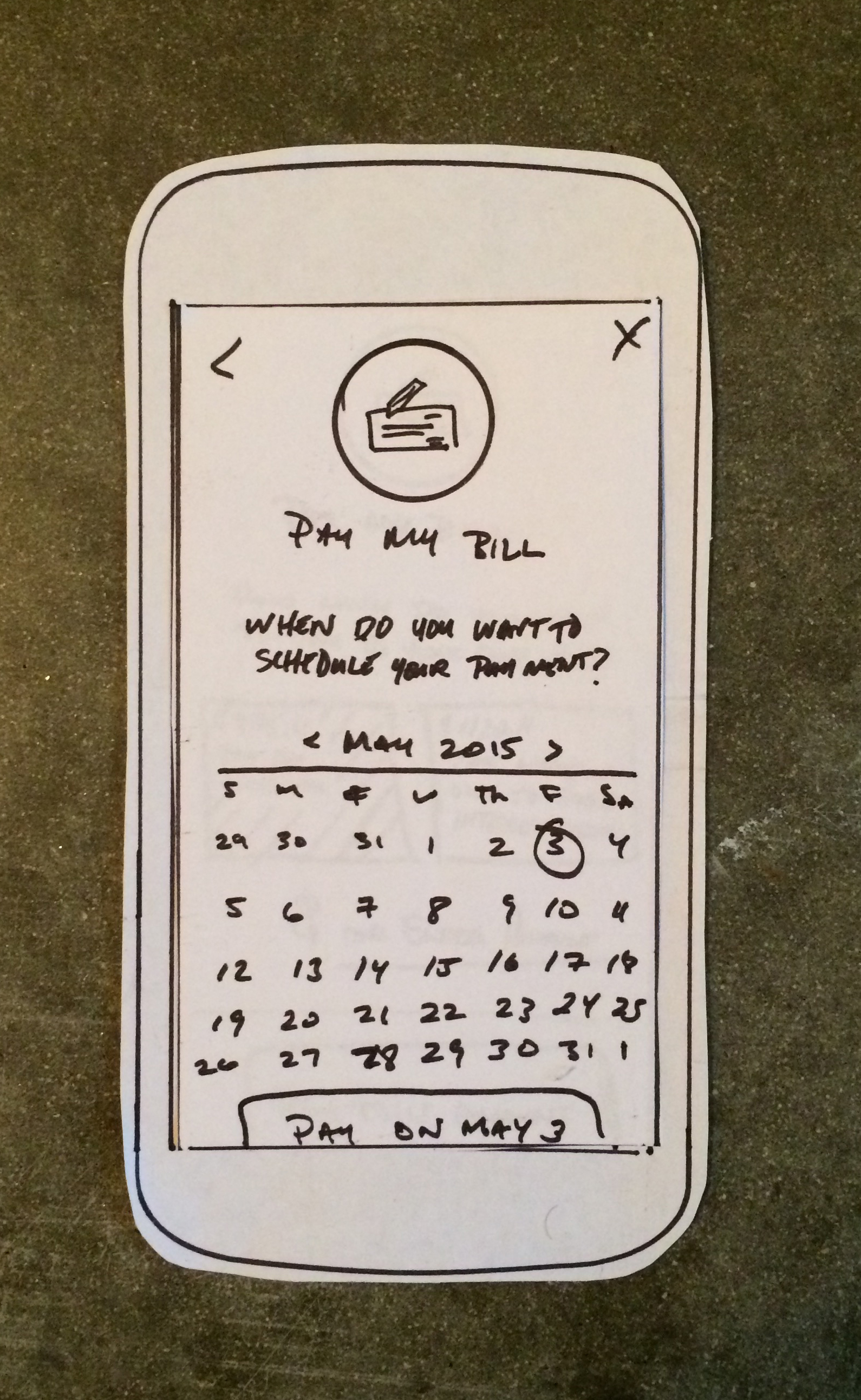
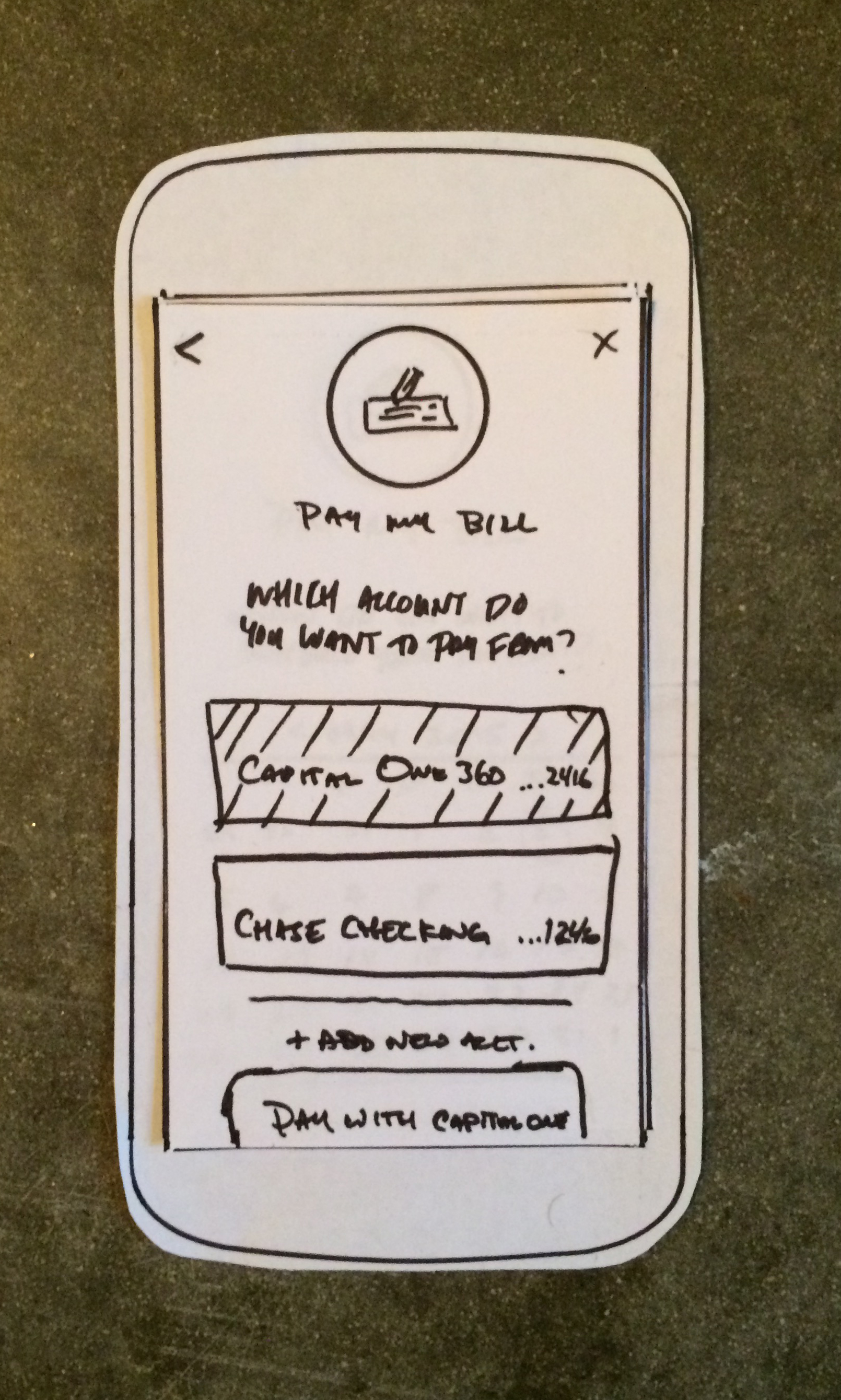
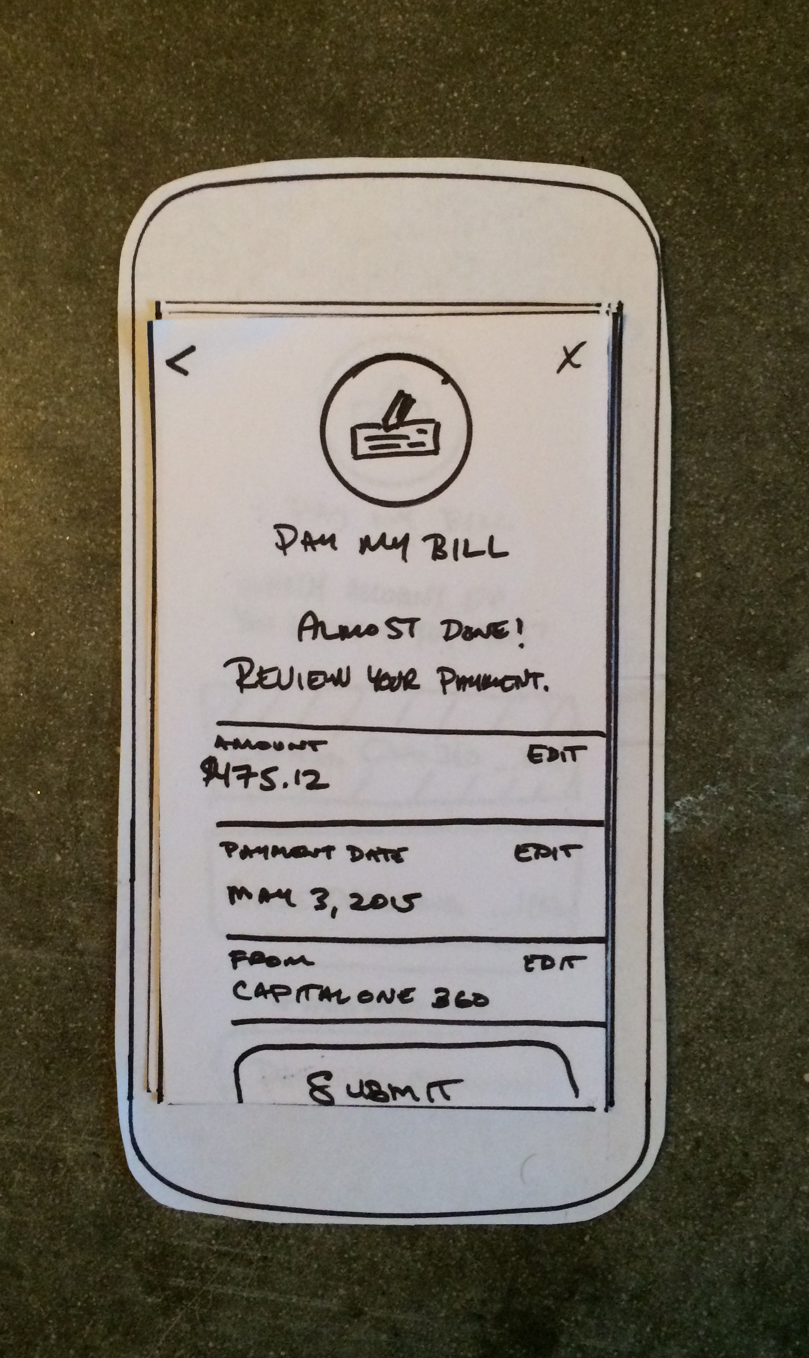
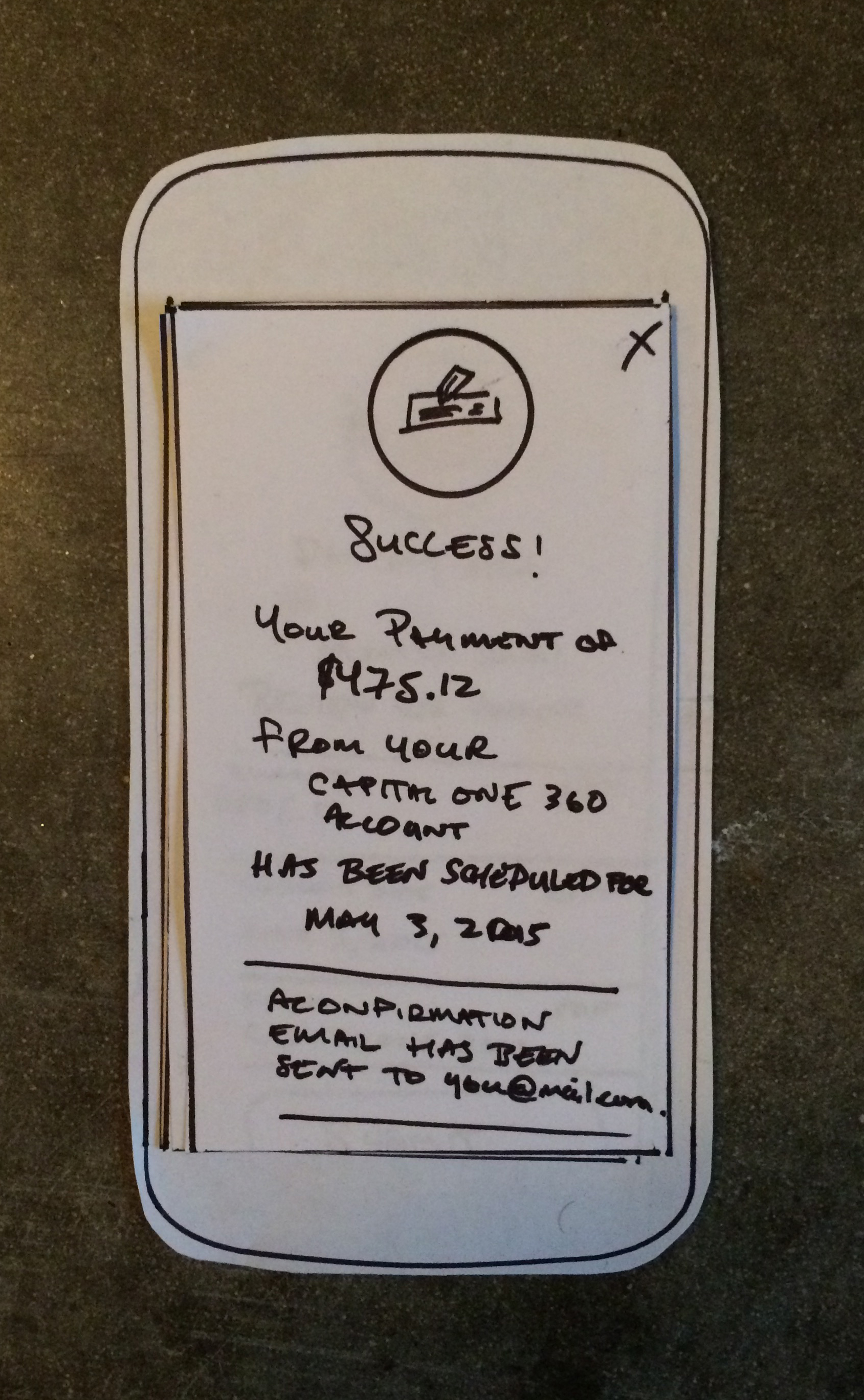
Paper Prototyping & Guerrilla Testing
—
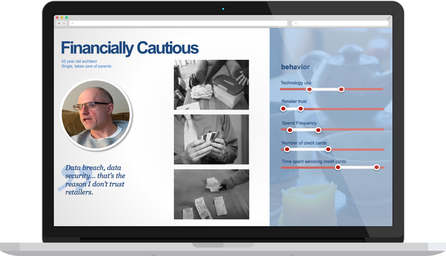
After looking into the legacy site's analytics, we discovered that 89% of all credit card servicing visits involved one of four tasks: paying a bill, checking a statement, looking at account activity, or checking the account balance. So, we decided to learn more about why those features were so important to start. We created paper prototypes and conducted guerrilla usability tests at a number of Chicago coffee shops.
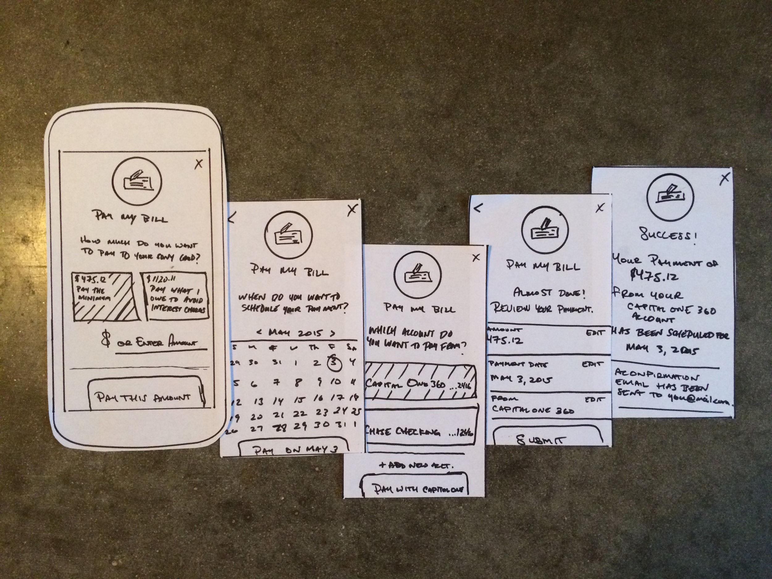
Iterative Testing & Visual Designs
—
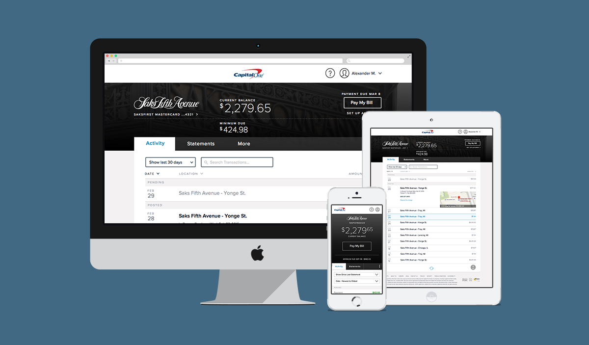
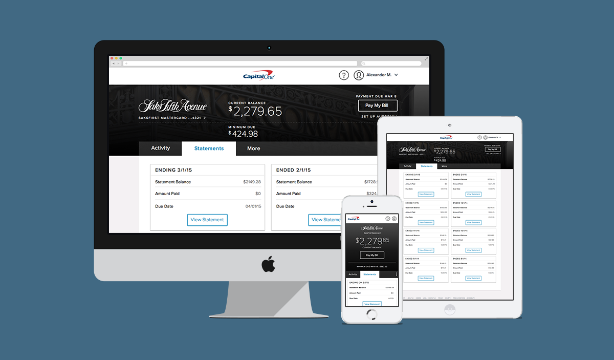
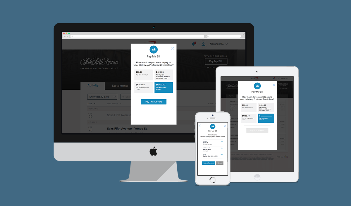
Once we had a solid idea of what our customer-base wanted from their servicing platform, we began building out increasingly higher-fidelity prototypes, and continued to usability test them. Initially we conducted virtual usability tests on usertesting.com, and after a couple of iterations, brought participants into our lab.
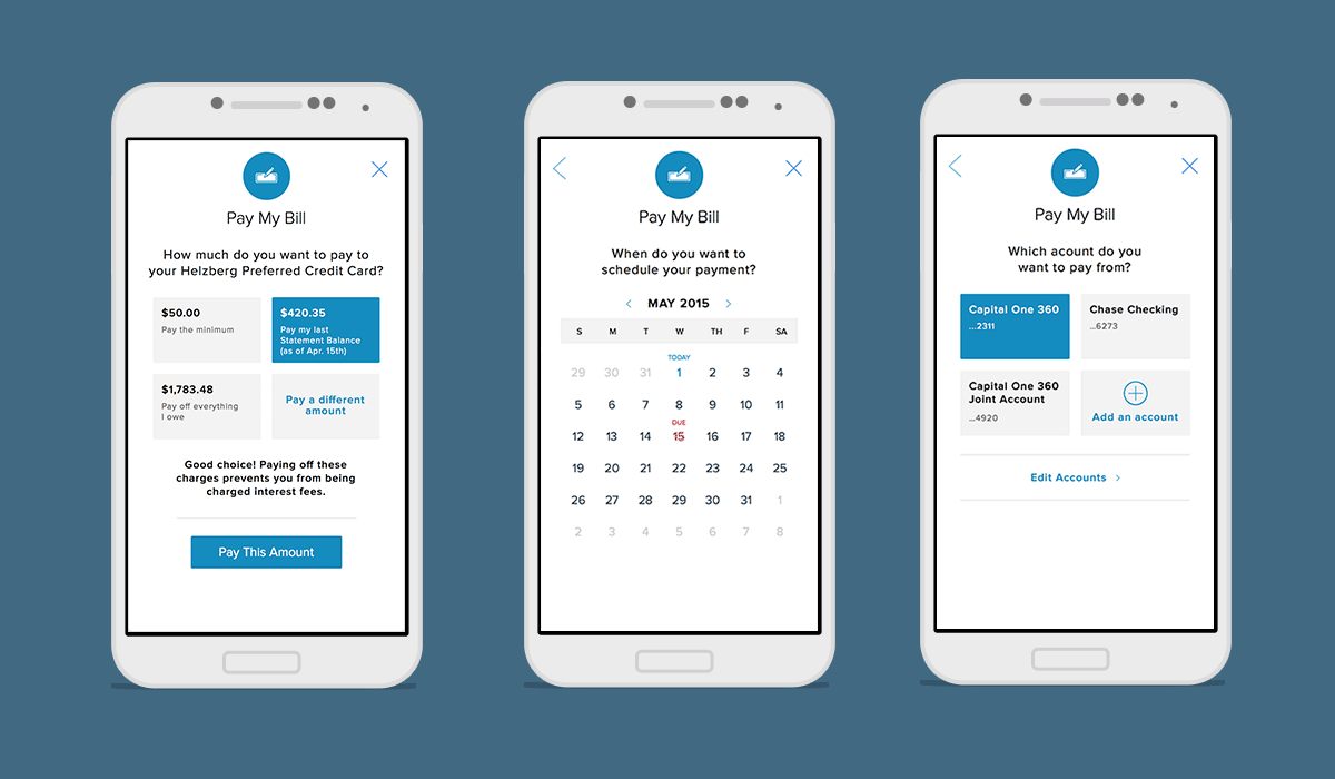
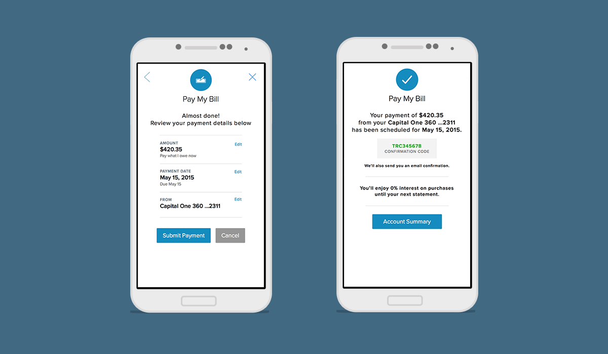
We centered the design around four most-used tasks, deliberately bringing all four to the forefront once a cardholder logs into their account making it easy for customers to find and traverse the actions at a glance.
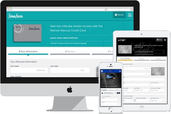
Partner Migration Rollout
—
We then had all the pieces in place for our initial MDP (minimum desirable product). We began our rollout to a single partner to start. From there, we began to roll out to more and more partners, adding additional features along the way. Since, the platform has been rolled out to 11 partners, with 8 more in the pipeline.
Check Out Some Other Capital One Projects
–