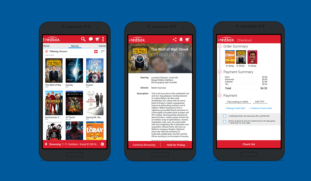
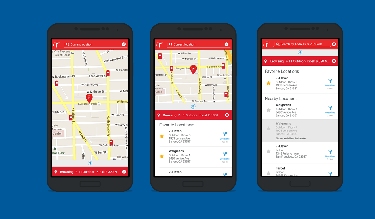
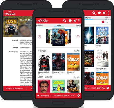
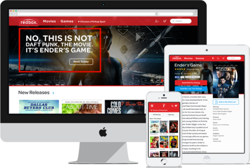
The Redbox Android app was still in its first release when I came onboard the project team, and it was a mess. It looked like an Android app wearing iPhone clothing, and the functionality left much to be desired. It was in dire need of an update.
Initial Sketches
—
I began sketching in the visual language of Android to see how we could incorporate their visual language with Redbox's box-art focused interface.
IA & Iterative Usability Studies
—
Once we had some solid sketches down, the information architects on our team began creating wireframes and interaction notes. From there, we took the wires and did some initial usability tests, where we learned how useful Android's overflow menu located on each movie's box art really was. It was something we assumed participants would overlook, but nope!
Visual Design & Usability Testing
—
Based on these learnings, we created our visual design experience. We continued to test and iterate until we created a user experience that tested well that met our customers needs and was something we were excited about. The eventual result of the redesign was a 53% lift in conversion.
