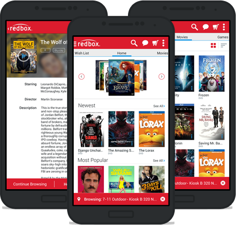
After finishing our initial customer research, we were ready to start designing. Lucky us, the Redbox.com site was well overdue for a redesign. We knew we had to modernize the look and feel of the experience, but we also had to update the functionality to better fit what our customers actually wanted to do with the site.
Competitive Audit & Mood Boarding
—
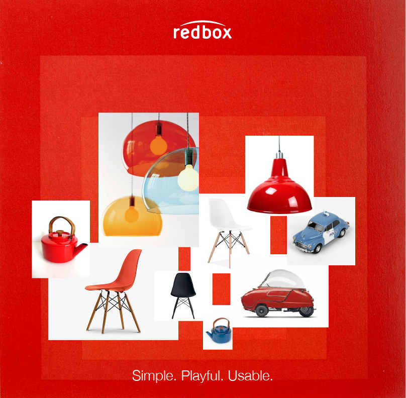
To assess the current competitive landscape for our product, we combed the internet for video streaming sites, eCommerce sites, and imagery from both video game production houses and Hollywood studios. We filled an entire room with the imagery and screencaps. We sifted through everything from trends, to best-practices, to horrible implementations.
We then created a mood board that fit within Redbox's new marketing brand standards, and would enable the design team to start creating with a clear vision in mind.
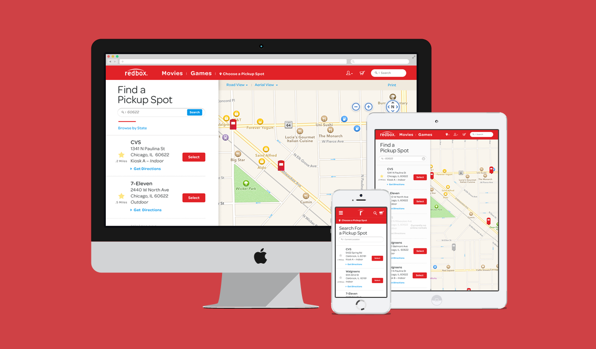
Information Architecture & Usability Studies
—
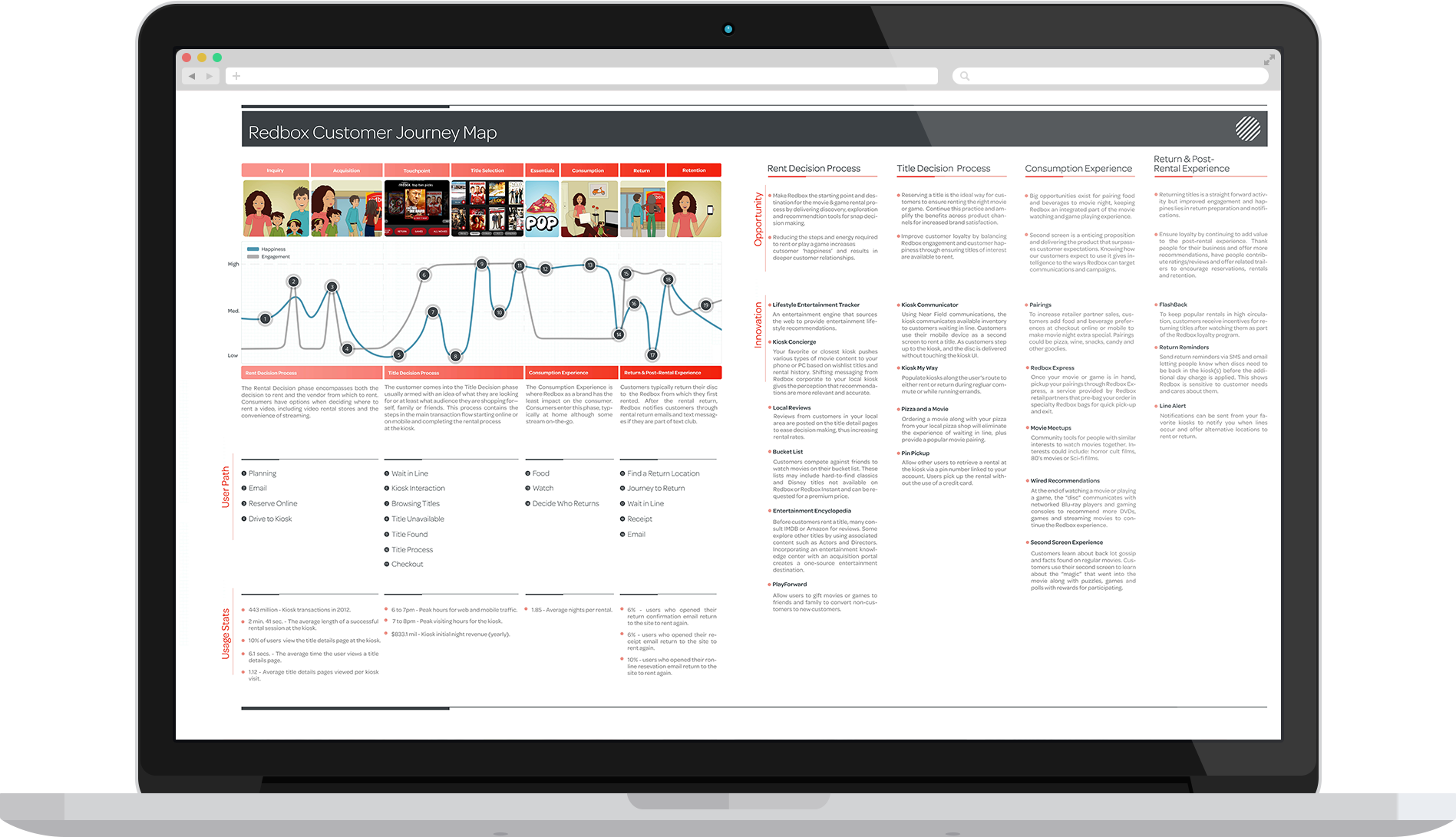
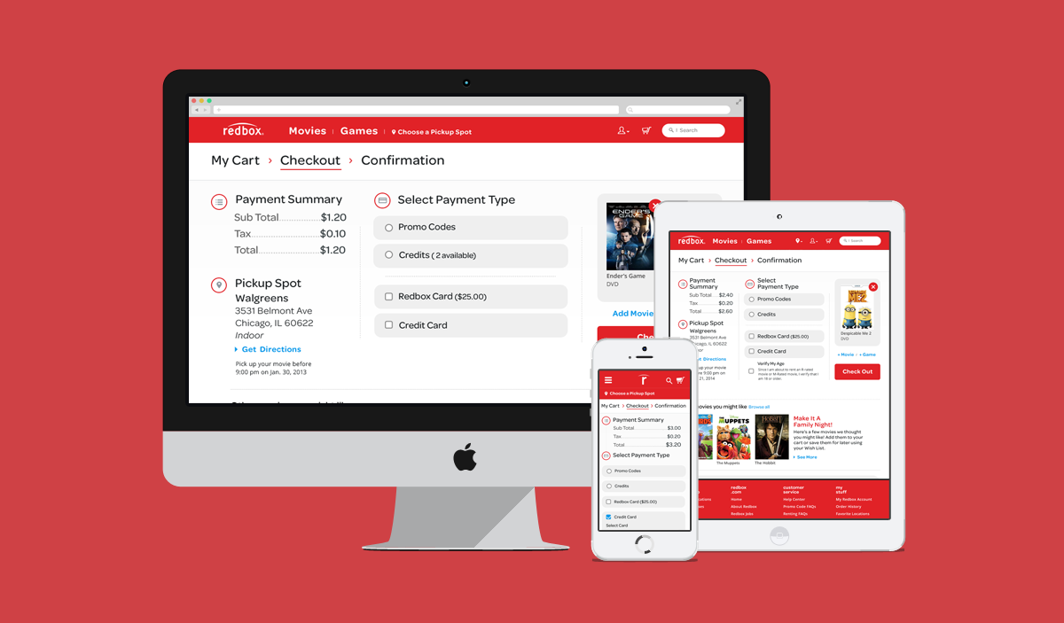
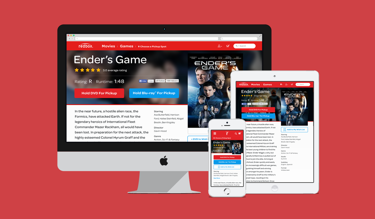
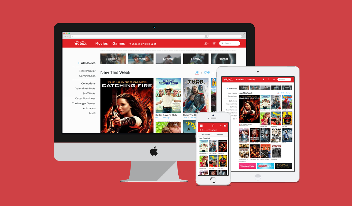
Our research informed the initial wireframes that our talented information architects built. We used these to conduct a usability test. The feedback from this first session led to several iterations of the architecture. Once we’d established a flow that worked, we started to create our visual designs.
Solving for Wayfinding
—
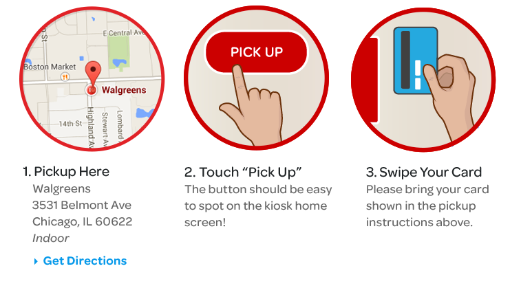
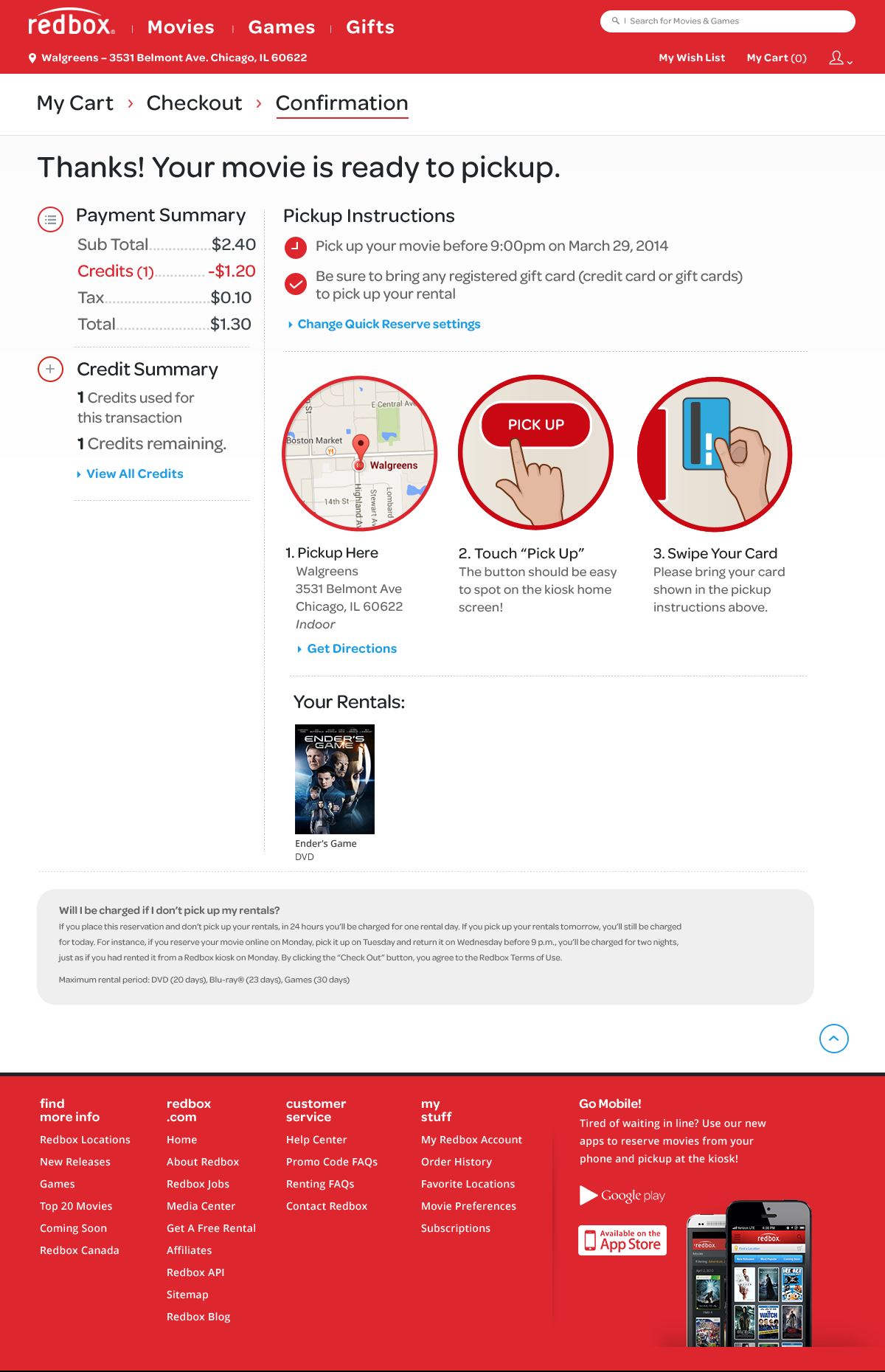
In that initial usability test, we found that our participants were having trouble understanding what came after reserving a movie from the Redbox.com site. The next step was to go to the kiosk, swipe your credit card as an identifier and pick up your movie. So, we experimented with several iterations on how we could display these directions clearly and concisely. We came out with an illustrative guide on the confirmation page that highlights next steps.
Visual Design & Usability Testing
—
In our successive usability tests, the wayfinding guide outperformed the previous version, clearly articulating the next steps for each moviegoer. And the newly designed Redbox.com site outperformed the old site in usability tests and went on to increase conversion by an average of over 28%.

Check Out Some Other Redbox Projects
–